10 tips that will increase the conversion of your online store - Part II

How to design a website that converts? If there were a perfect recipe for it, all websites would look the same, but that's not the intention. All companies are different and have different needs — thankfully. In spite of this, Yes, there are some useful tips applicable to all online stores if what they want is to increase their conversion. And who doesn't want this?
First of all, there are some basic elements that should be put into practice to ensure a user-friendly experience and fluid on a web. We have previously written about this in this article: 8 tips for a user-friendly website. But we also have some tips for payment flow. The last time we discussed the topic, we shared 10 tips that will increase the conversion of your online store.
This time, we're sharing 10 new design and content tips, which will hopefully help you improve your conversion — and avoid absurd nonsense like this:

... so crazy that it's probably in very few online stores, if any.
10 tips to increase your conversion:
Tip 1: Make the path to conversion more visible
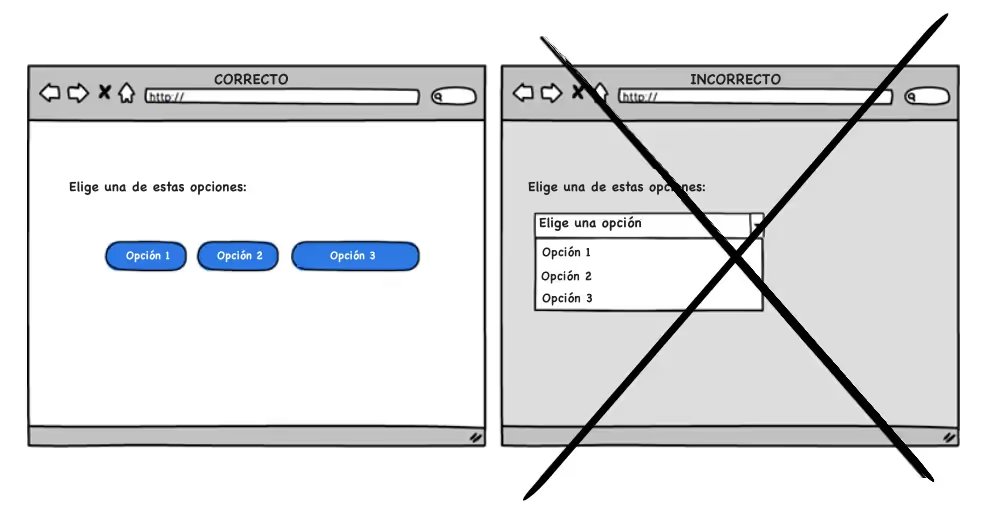
Be careful that using a drop-down menu becomes a habit. A dropdown isn't necessarily a wrong way to navigate, but if the dropdown options are important to convert, then it can become dangerous. Instead, shows the options; a drop-down creates more confusion.
Tip 2: Focus on the main CTA (Call to Action)
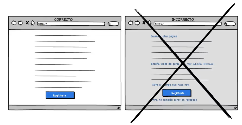
You can create a page full of links in the hope of meeting all the needs of your customers; or to create good internal linking. Keep in mind that Any link above the main CTA increases the risk that your customers will stray from what you really want them to do. By eliminating unnecessary links — especially on landing pages, you increase the chances of the user clicking on the main button.
Tip 3: Eliminate unnecessary items that attract attention
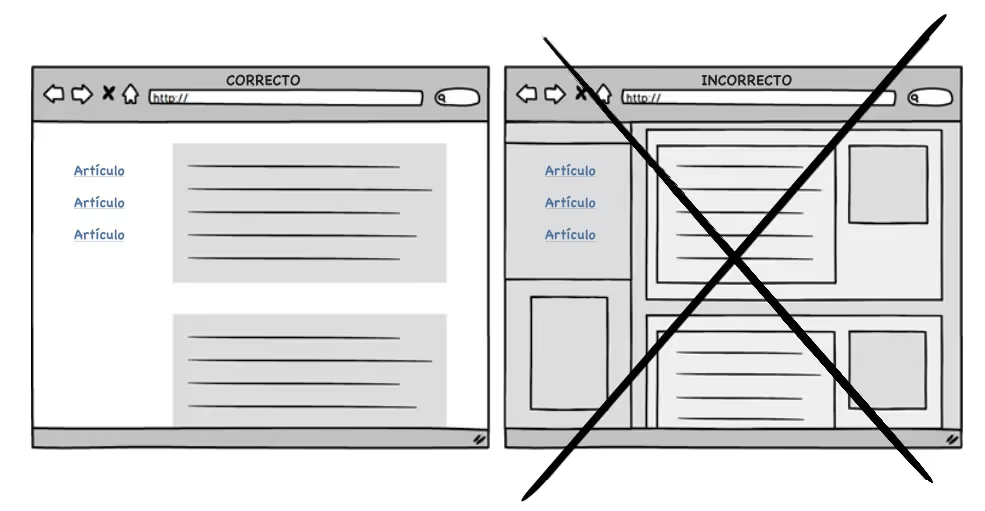
Boxes and frames compete with your content and can distract attention. Attention is your most important resource for converting. Frames can define spaces and content groups, but they can also be distracting if there are a lot of them. So, keep your content simple and think of other ways to divide it up. You can use, for example, dividing lines, typography, or dimmed backgrounds.
Tip 4. Sell the benefits, not the functionality
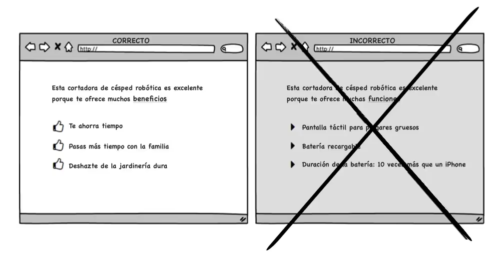
A tip on content, we like to know more about the benefits of something than about its characteristics, since the benefit gives us value. Why do we buy a robotic vacuum? Because it saves us time, it gives us more time to spend with the family and frees us from having to move the couch to vacuum. This doesn't mean that there isn't room for both, but it's better to show functionalities in a secondary role and, if possible, show them as benefits.
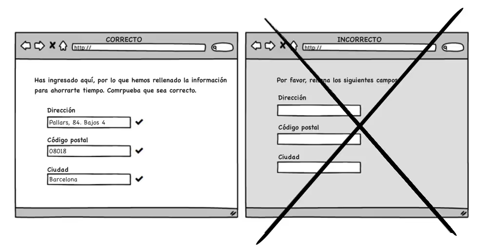
Tip 5. Use pre-filled fields
One of the worst aspects from a user friendly perspective is to continuously ask for data from users who have already given it to you in the past. Instead, show fields filled in with already filled in data that require validation, instead of having to ask that they be filled in each time. The less you make the user work, the better.
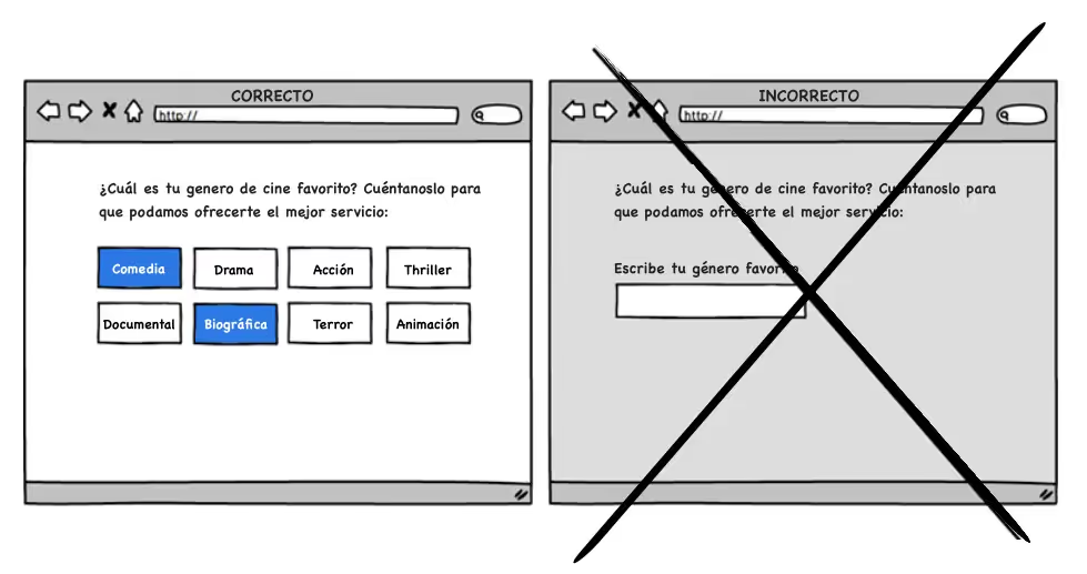
Tip 6. Helps the user to remember
Psychologically it is easier to recognize something existing than to have to remember something that is in the memory. Using only memory can be an effort and is not recommended for a conversion. Therefore, offers users the opportunity to identify something they know, instead of waiting for them to remember it on their own — with an open field.
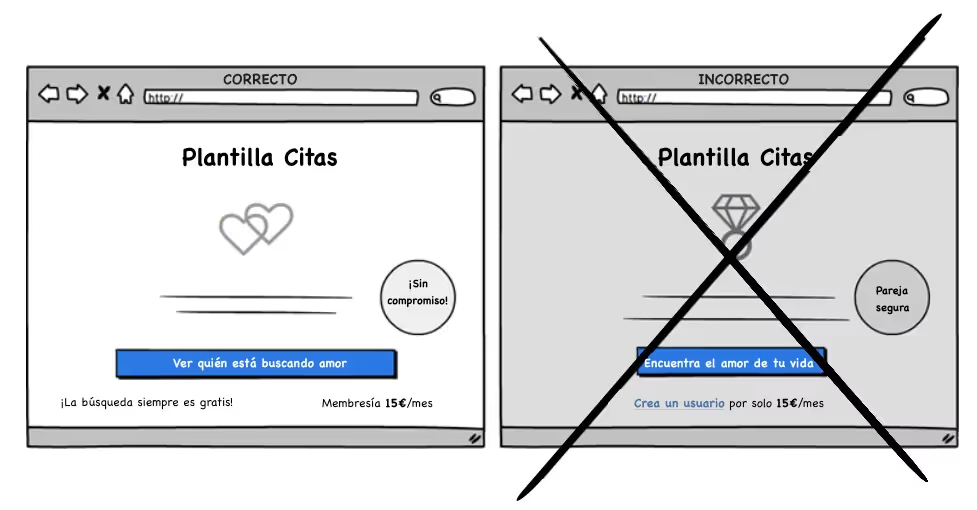
Tip 7: Get your foot in the door
Big commitments can scare people. Therefore, it starts little by little, from less to more. It's like the “stick your foot in the door” technique: get a yes for a small favor first, in the hope of getting another yes for a bigger favor. Therefore, invite the user inside, let them look around and let their guard down. A related tactic is to show a non-binding offer.
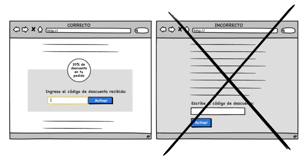
Tip 8: Pay extra attention to important things
Pay attention to the most important actions and get rid of everything unnecessary. This can be done in many ways, for example, with a difference in sizes, a higher contrast, white spaces, or using shapes and colors that differ from the rest. You don't need to use every option, and be careful not to make it look like an advertisement.
Tip 9: Show examples and increase sales
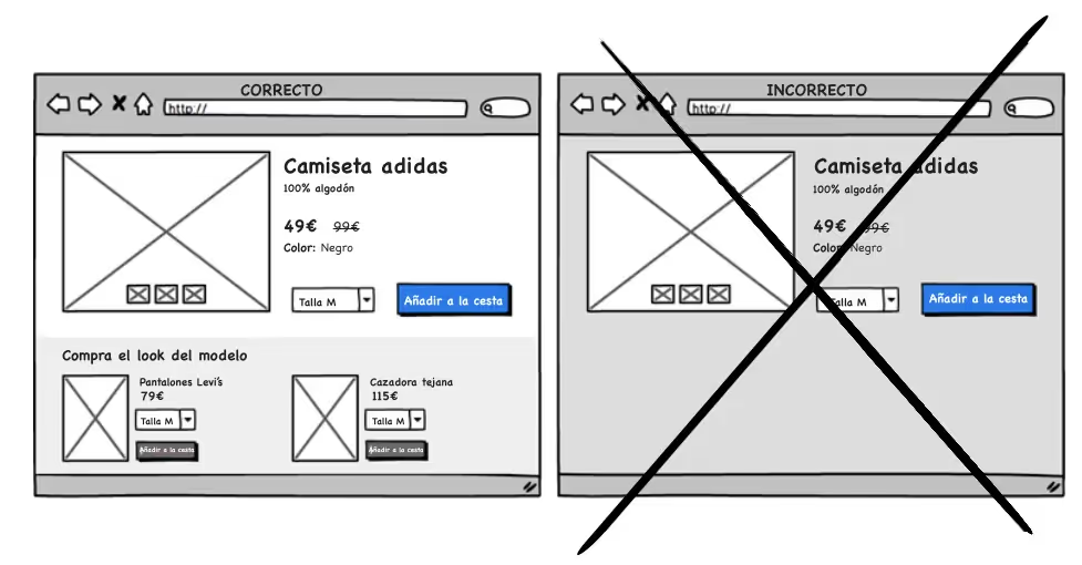
Take the user by the hand and show them an example. Choose, for example, a product page in an online clothing store. Instead of just showing the t-shirt, it also shows the outfit the model is wearing and increases the chances of another purchase. This allows you to add all the pieces of clothing from the product page. It can increase motivation to buy a complete set if there are only a few left. Be sure to show the number of pieces in stock if there are a few left. And show it by size, if possible.
Tip 10: Let Authenticity Shine
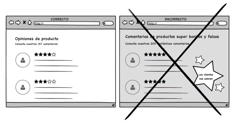
Keep your online store authentic, show reality and not a perfect story. Get rid of photos where people are smiling for no reason and Make sure you offer a sample of positive reviews and others that aren't so positive. Users are looking for the bad — and sometimes by reading the wrong, the user reaffirms their desire to buy.
How can we help you?
If you need more information, do not hesitate to contact us.
Cómo podemos ayudarte
Consulta los servicios con los que te ayudaremos a conseguir tus objetivos digitales.
