10 tips that will increase the conversion of your online store - Part I

The most important thing in a webshop It is, of course, that the products go through the box. Therefore, your website must be easy to use and focused on the user throughout the process.
Here are some tips for good usability which will almost certainly simplify your design, make it easier to use and increase your conversion.
10 Tips that will increase the conversion of your Online Store
Tip 1: Reduce input fields
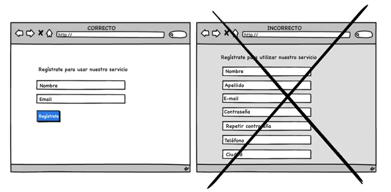
For every field you make the user fill in, the risk that their patience will run out increases. Ask yourself the question of whether each field is really necessary. If it isn't, remove it. Think about whether some of them can be completed later, such as when the user has become a customer.
Tip 2: Wake up the user with gradual engagement
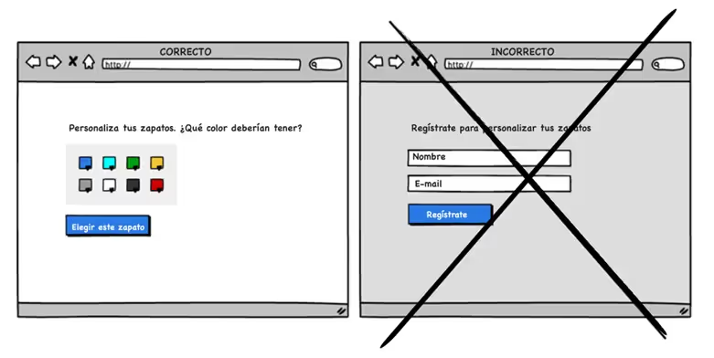
Instead of prompting the user to register immediately, allow him to explore the service or product first. When users start to see the value of your product, they're more open to registering or making a purchase decision.
Gradual engagement is a way to postpone the registration process and at the same time allows the user to use and customize your product or service.
Tip 3: Make the price more digestible
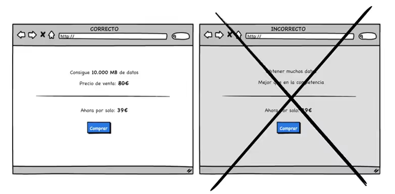
Our decisions are influenced by the first thing that captures our attention. If we start with a higher price and go down to a lower price, the real price suddenly doesn't seem that big to us. In other words, the user perceives that they are receiving a discount.
You can, for example, use a crossed out target price that precedes a lower price, such as the following example:
Tip 4: Make your audience visible
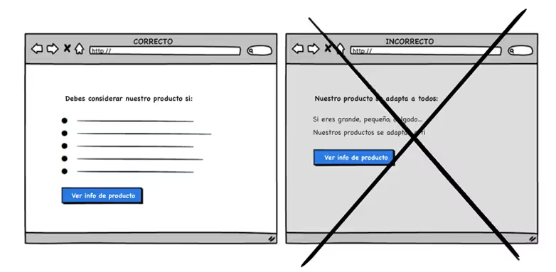
Are you addressing the masses or your target audience? With this strategy, you explicitly say who you are targeting your product or service for. By communicating the characteristics that match a particular type of customer, you can better convince them to make a purchase and, at the same time, give them a sense of exclusivity.
The risk with this strategy is, of course, that you narrow the description a lot and therefore limit the number of potential customers. Transparency about your product builds trust.
Tip 5. Put text on your icons
Icons can often be open to interpretation. For example, the “an arrow pointing down” icon. Does moving something down mean lower priority or is it a download icon?
By combining icons with words, you can easily eliminate much of that ambiguity.
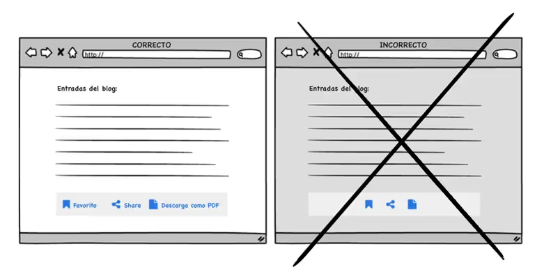
Tip 6: Give something - and get more in return
Curiosity is a conversion technique that attempts to activate the buyer's desire to buy, offering something of value. For example, showing the first chapter of a book: if the user has questions about whether to buy the book or not, they can read the first chapter to feel comfortable with the purchase.
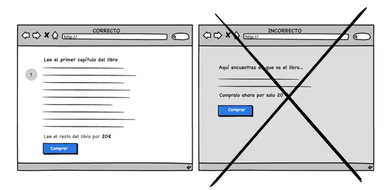
Tip 7: Repeat your main Call-to-Action
Repeating your main Call-to-Action strategy is more applicable to longer pages.
It is important to do the Distinction between “call” and spam. The user doesn't want to see a buy button 10 times on the same screen. Therefore, a good practice to encourage buying is to show a buy button next to the price “above the fold” and show a buy button again at the bottom of the page.
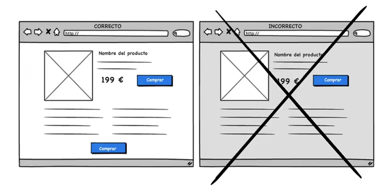
Tip 8: Buy now!
This persuasion technique can be used to make the user act now and not later (or maybe never).
You can see it when you are going to book a hotel, for example. Persuasive messages such as “Only one room left” or “Get 10% off if you buy within the next 2 hours” are usually displayed here. It works because it infuses a certain degree of risk that what's available now may not be available later.
Some people don't look kindly at this strategy, which they call it a “dirty” way of inciting people to act. However, it's a strategy that usually works, so as long as it's honest, you can consider whether to use it or not. But be careful about creating a false sense of accessibility — because it could backfire.
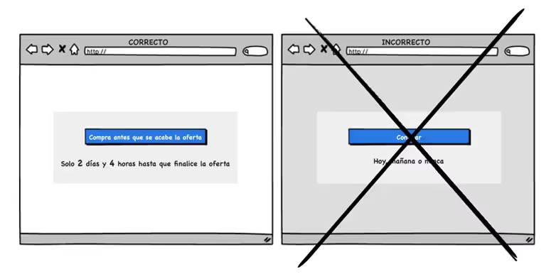
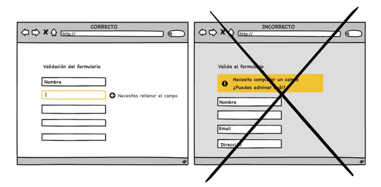
Tip 9: Use online validation and avoid delays
When a field is incorrectly filled in, show it immediately instead of showing an error message when the user has tried to press the “continue” button. Show the message when the field is being filled in, allows the error to be corrected immediately. If, on the other hand, it appears at the top after pressing the continue button, you force the user to remember what they did in the previous steps.
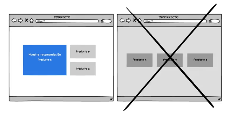
Tip 10: Give the user a boost with recommendations
When you show multiple offers, a highlighted suggestion may be a good idea. Some users need a “push” and a recommendation. Showing too many options can create psychological indecision about what should be chosen. Therefore, it is best to highlight only one product and show a recommendation based on user behavior, if possible.
How can we help you?
If you need more information, do not hesitate to contact us.
Cómo podemos ayudarte
Consulta los servicios con los que te ayudaremos a conseguir tus objetivos digitales.
