The relationship between user experience and conversion rates

From the Novicell design team, we believe that a good user experience is crucial to having a good conversion rate. Let's look at an example together:
It has ever happened to all of us to have to go to a supermarket that is not our usual one. It's a real test of patience. Finding the product we want is not an easy or quick task and when we find what we were looking for, the line is usually long and the cashier is slow. The result is usually always the same: we leave the products there and we leave frustrated because we have wasted time. This feeling is the result of a poor user experience, and the same can happen in an online shopping situation.
So how can we know if we're offering a good user experience?
This question was what led a company in the retail sector to seek our help.
A Spanish retail brand with exclusive online sales contacted Novicell because it wanted to rely less on Marketplace and sell more through its own e-commerce. However, sales on their current website were not what they expected, and their hypothesis was that this was due to the unclear structure of the website, which resulted in a confused user not knowing what direction to take.
Our team advised that a UX auditing to validate that hypothesis, detect user friction points on the web and thus propose improvements in the conversion.
A UX audit consists of analyze data to detect behaviors and patterns, and talk to users to understand the reasoning behind those actions. In this case, we did a full audit, with the following quantitative and qualitative analyses:
- Analysis of user behavior with Google Analytics and heat map tools to detect behavioral patterns.
- We contrast these patterns with Moderate user tests done remotely.
- Finally, we made a heuristic analysis of the web And a Benchmarking with major competitors and marketplaces to identify user experience standards and trends in the industry.
Each of these analyses allowed us to identify weaknesses in the web, user needs and opportunities for improvement to propose to the customer.

In the case of this customer, some data attracted a lot of attention:

Purchasing behavior data. Google Analytics.
- Of all the sessions on the web, 91% didn't see any product, which is remarkable when it comes to e-commerce.
- Of all the sessions with visits to product pages, the 87% did not include the action of adding to the cart.
- Mobile devices accounted for 69% of web users, as well as 59% of revenue. However, on the product pages, the 50% of users couldn't finish seeing the product's features.
- 56% of sessions with products added to the cart abandoned the purchase process.
Thanks to the data collected and analyzed, we knew that we needed to understand:
- Why aren't users viewing products?
- Why don't they add products to the cart?
- When they add products to the cart, why do they abandon the purchase process?
With these questions in mind, we went to speak directly with the users and put the customer's website to the test.
The first thing we discovered was that the navigation menu didn't fit the mental model of the users and In 50% of the tests carried out, there were problems with product categories.
“The first thing I do is go to the menu. If I see that I'm not sure, as is the case now, I go to the search engine!”
We identified a serious problem with the web search engine, which did not allow standard actions such as filtering or sorting search results. For this reason a 33% of users felt that search results weren't relevant and some said they would leave the web at this point.
All users Those we spoke to considered that They were missing information on the product page to be able to decide if the product fit what they were looking for.
“I see it as poor... I don't know the voltage or the protection index... I'm missing information.”
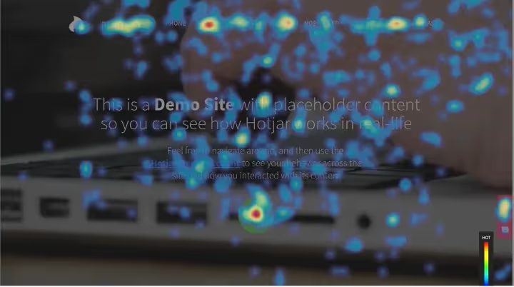
The curious thing is that, in many cases, the information if it was present on the web. The reason why users found it difficult to find the information they wanted was revealed in the heat maps: Very few users scroll through the product page. For that reason, we recommend redistributing the content of these pages according to the priorities of your customers.

*Heat map demo with% of clicks. Source: Hotjar.
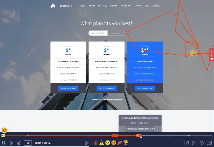
Also with heat maps, we identified that adding a product to the cart and completing a purchase was the task where users had the most difficulty. The session recordings showed users spinning around a lot with their mouse, scrolling up and down, clicking on non-clickable elements and trying to fill out the form with difficulty.

*Demo of behavioral recordings. Source: Hotjar.
Later, with user tests, we were able to validate our suspicions: the checkout flow was confusing and they highlighted two main points:
- There was a delivery method notice in red. Users thought it was a mistake and they were frustrated. “How come there's already an error? If I haven't touched anything...”
- Users could not find information about the delivery time and did not want to commit to the purchase without having this information.
With this information, we concluded that the interface of the checkout process was difficult and unclear, and did not fulfill its role of guiding and communicating with users.

La user experience What the website offered was, in general, confusing, time-consuming and frustrating. Very similar to the experience of buying something in a supermarket that you don't know.
The conclusion of the audit was that the website was not optimized for conversion, that users had problems finding products with the menu and that they were experiencing friction when placing their orders.
But it's not all negative. Thanks to the audit, we know exactly where the friction points are and what are the main points of improvement on the web, so we were able to deliver to the customer a plan of improvement actions ordered by priorities and elements to be edited on the web, focused on achieving the improvement of the user experience offered.
The process of implementing these improvements is still being carried out and thanks to our help, the customer now has the necessary tools to focus their work on obtaining an improvement in usability and user experience of their website.
Next, some of the improvement actions proposed by our team:
- Improve loading speed on the web.
- Modify the cookie banner so that the user can customize the cookies they want to accept.
- Prepare a Design System that unifies and regulates the design of buttons, links, colors, fonts, spaces and alignments on the web.
- Simplify elements such as the navigation menu and forms to reduce the cognitive load of the web.
- Provide feedback at all times to manage user expectations and make browsing more pleasant.
Finally, it is important to highlight that the improvement of the user experience is a continuous process of analysis, testing and implementation of improvements. Our users are always learning new things and their expectations and mental models change over time. For this reason, it is important to keep the analysis tools active and the process of continuous improvement of your website.
Our team of UX designers can help you understand the experience of your current users and create an action plan to help you achieve your business objectives.
If you need more information, do not hesitate to contact us.
How can we help you?
If you need more information, do not hesitate to contact us.
Cómo podemos ayudarte
Consulta los servicios con los que te ayudaremos a conseguir tus objetivos digitales.