How to design usable forms to improve your conversion

Best practices in UX for forms
For many companies, both B2B and B2C, the capturing leads through contact forms constitutes one of the main sources of recruitment, if not the most important.
That is why we must pay special attention to contact forms, because of their good performance It depends on our trades.
For this reason, in this article we propose to teach you 13 tips to consider when designing forms, so that you can optimize those on your website or those of your landing pages for recruitment.
13 Tips for Designing Forms That Improve Your Conversion
1. Don't hide what you can show
If you can show the information instead of hiding it, show it unless it's too much. In the case of fields on a form, it is preferable Show options if there are few You have to put a drop-down menu, useful when there are a lot of options to choose from.

2. Provide feedback to the user
At all times and in every action that the user is carrying out, it is essential to give the user feedback on what is happening. In the case of forms, it is important Report errors that may exist when filling in the fields, which we must indicate clearly, with simple language and symbols, without technicalities and providing information so that you can undo the errors. Also, when the fields have been filled in correctly, we will also give positive feedback, showing validations.
3. Use a column for your forms
Avoid adding multiple columns for your form fields: The People read from top to bottom, if we incorporate fields on the left and right we are making the process difficult. If we have a lot of fields, there are alternatives to columns to show them in a more usable way, as we will discuss in the following tips.
4. Group related information
In forms with long processes, where we need a lot of user information, it is preferable to group the information by topic.
5. Divide into steps with visibility of the state you are in
The option of dividing the process into several steps can be very positive and some studies state that Improves the conversion.
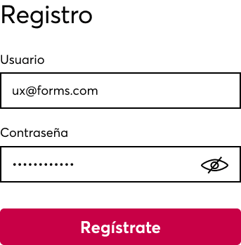
6. Embed labels and inputs for each field
The user must be clear at all times What kind of information you have to add in each field. Therefore, the labels above each field are necessary, as are the texts inside the field, the input text, which serve as an example and disappear when you type.

7. Avoid using capital letters
Capital letters They don't make it easy to read, makes it take longer for us to read content, so as far as possible, it is better to avoid them.
8. Use conventional icons and colors
For errors, icons such as an X and red colors. For positive feedback, the green color and check icons would be a Convention. To make, for example, a password visible, the use of the eye icon is also widely used. However, many times an icon will not be enough to understand a concept, it is more effective combine icon with text, in many cases.

9. Use descriptive Call-To-Actions
The CTAs on the main and secondary buttons should be descriptive and concise, that clearly communicate what it means to click or touch that button. The less generic and more concise, the better. And if we can include the first person singular, even more effective. For example, if we are designing a form for a subscription, the CTA could be “I want to subscribe” instead of “Submit”.
10. Affordance for the Length of fields
In UX, Affordance is used for indicate properties of interface elements that show users what actions they can perform with them. Thus, for example, a button with a CTA is widely used because users quickly perceive that it can be clicked, as they would in an offline environment to activate a button. In the case of form fields, the fact that a field is more or less long can be perceived as needing more or less information to be completed, so it is important that The length of the field matches the length of the text that you need.
11. Better a hidden Captcha
As far as possible, we will try to avoid a visible captcha in our forms, it is much better to configure a hidden captcha than to ask the user for additional validation actions, since generates friction unnecessary.
12. Don't forget about accessibility
The forms must respect the accessibility regulations so that all users can fill it out without problems. It is important to review contrast, tab navigation, and more. If you are interested, you can Read more about accessibility.
13. Configure input types correctly
In Mobile, this point is fundamental. So that you can Show the right keyboard in each field, it is essential to configure each field with a specific type of input. This is the list of the most common field types:
- input type=” text” shows a common text keyboard
- input type=” email” shows a common text keyboard and also an '@' and a '.com'
- input type=” tel” shows a 0-9 numeric keypad
- input type=” number” shows a keyboard with numbers and symbols
- input type=” password” hides characters as you type
- input type=” date” shows the date selector

Don't take anything for granted
La experience of filling out a form can be perceived in a long, boring or uncomfortable way, so we have to try to reverse it, making the experience as smooth as possible, that is not perceived as an obligatory procedure but as one more part of the navigation through our site.
Therefore, in addition to applying the tips above, at Novicell we recommend that you do not take anything for granted: Just because you understand it doesn't mean that your users understand it. In forms, and in general in any interface, it is essential to know the users who are going to interact with it. And to know them, it is necessary empathize with them through research and user test.
Do you need your website to take your users into account?
If you need more information, do not hesitate to contact us.
Cómo podemos ayudarte
Consulta los servicios con los que te ayudaremos a conseguir tus objetivos digitales.
